What Pages Do I Need on My Website? Start With These 5

Learn more
I'm Angela
A bit of a unicorn: 18+ years of left brain analytics and right brain creativity, now channeled into websites and branding for creative entrepreneurs. My passion is helping women-owned businesses grow, without burning out and without having to choose between family and business.
INSTAGRAM
FACEBOOK

You opened a blank website builder, stared at the page list, and immediately felt behind. Home. About. Services. Blog. Portfolio. FAQ. Resources. Press. A shop you do not have yet. And somewhere in there, a nagging feeling that everyone else got a checklist you never received.
So you ask the internet, what pages do I need on my website, and you get a list of fourteen. That is not help. That is a reason to close the laptop.
That overwhelmed feeling makes sense. You are being handed a page list built for a company with a marketing department, and asked to fill it as a one woman business.
So let’s walk through the actual pages you need and what should go on each one.
Every Page Has One Job (And Why That Answers What Pages You Need on Your Website)
Here is what usually happens. The about page turns into a life story. The home page gets a headline that says what you do and then whatever else felt right that day. The pages get filled, not planned.
Nobody stops to ask the question that actually matters, which is: what is this person trying to find out when she lands here?
Think about how you choose a hairstylist. You do not read her whole site. You look at her work, you check if she does the thing you want, you decide if you like her, and you look for the button that lets you book. Four moves. That is the whole path.
You do not need twelve pages. You need five pages that each answer something.
So as we go through these, keep asking what job this page is doing. That one question will tell you what belongs on it and what does not.
1. The Home Page
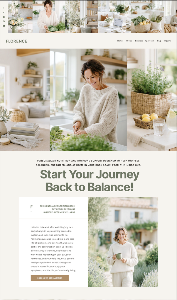
Your home page is not your life story. It is a signpost. Someone lands here and needs to know within about five seconds who you help, what you do, and where to click next.
The easiest way to think about it: your home page is a summary of everything else on your site. A taste of each page, with a link to the full version.
Start with one clear headline at the top that names your person and their outcome. Not “Welcome to my site.” Something closer to “Wedding photography for couples who want the day to feel like theirs.”
Under that, put one button. Not six. Send them to your services page or your contact page, and do not make them choose between five things before they have decided anything.
Then keep it short. A quick line about who you are, a preview of your services with links out, a few pieces of proof, and one more invitation to reach out at the bottom.
If your home page tries to say everything, it says nothing.
What this looks like in practice: headline, button, one paragraph about who you help, three service cards linking to the services page, two client quotes, final call to action. That is a complete home page.
Once those bones are in, you can add the extras that fit your business. A freebie or newsletter signup, a link to your latest blog posts, your social links, a short line about where you are based if you work locally.
2. The Services Page
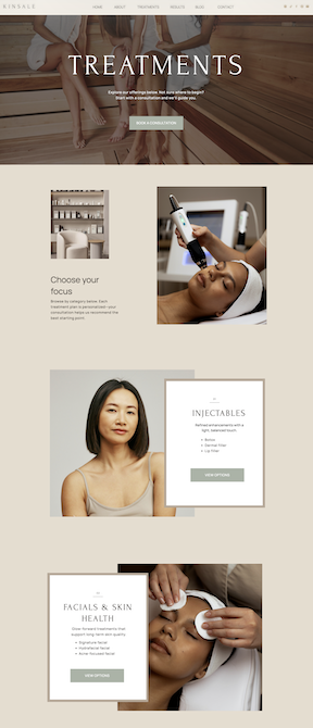
This is the page that makes you money, and it is the page most beginners rush.
List your services with real detail. What is included, who it is for, roughly what it costs or a starting price, how long it takes, and what happens after they say yes. Vagueness feels safer when you are new, but it makes people close the tab.
Walk them through your process too. Three or four steps is plenty. People are not just buying the deliverable, they are buying the experience of working with you, and knowing what happens week by week takes a lot of the risk out of saying yes.
A few testimonials on this page do real work as well. Not on a separate page they have to go find. Right here, next to the thing they are considering buying.
If you have more than three services, group them instead of listing everything flat. And if a service needs a full explanation to sell, give it its own page and link to it from here.
Pricing anxiety is the number one reason people leave a services page, so do not make them guess.
You do not have to publish exact numbers. “Custom website design starts at $X” is enough to let the wrong fit self select out and the right fit lean in.
End the page with the next step spelled out. Not “get in touch.” Something like “Book a free 20 minute call and we will map out what your site needs.”
Better yet, put an actual inquiry form or booking button right there at the bottom of the services page. If they are sold, do not make them click over to another page to tell you.
3. The About Page
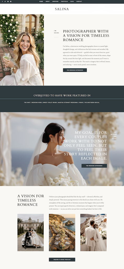
Here is what surprises people. Your about page is usually the second most visited page on your site, and it is almost never actually about you.
If someone clicked over here, they are already a little interested. They are not being nosy. They are deciding whether you are the right person to hand this over to.
It is about whether this person can trust you with their money. So write it as a bridge, not a memoir.
Open with them. Name where they are and what they want. Then bring yourself in as the person who gets them there, with just enough backstory to feel human. Why you do this work, what you believe about it, how you are different from the last person who let them down.
Include a real photo of your face. Not a logo, not a stock image of a laptop and a latte. A photo of you.
People hire people, and they cannot hire someone they cannot picture.
Then end it the same way every other page ends, with a link to your services or a way to contact you. An about page that dead ends is a wasted page.
4. The Proof Page
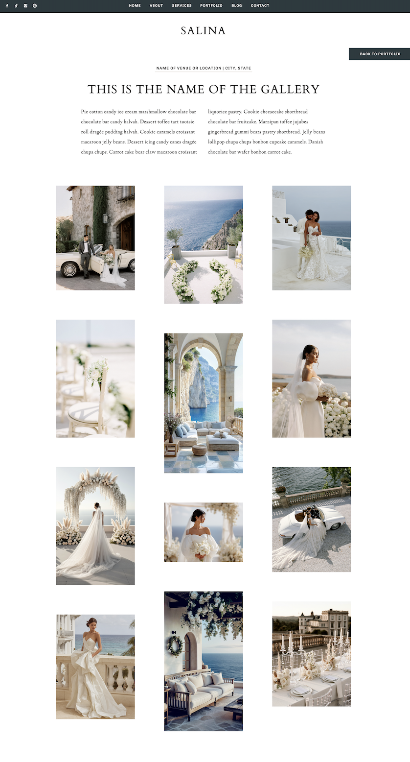
Call it your portfolio, your gallery, your case studies, or your client love page. The name does not matter. The function does. This is where you show that you have actually done the thing. Reviews count here too. A free Google Business Profile gives you somewhere for happy clients to leave proof that also shows up in search.
For visual businesses like photography, design, and events, this is a portfolio. Show your best work, not all your work. Fifteen strong images beat sixty average ones.
For non visual businesses like coaching, bookkeeping, or wellness, this is testimonials and short before and after stories. Two or three sentences each. What was hard, what you did, what changed.
If you are brand new and have no clients yet, use what you have. A friend you helped, a project from a previous job, coursework, a personal project you did for practice, a detailed walkthrough of your process so people can picture working with you.
That is not cheating. If you can show that you know what you are doing, you know what you are doing. And if you need more, offering a few discounted or free spots in exchange for photos and a testimonial is one of the fastest ways to fill this page.
One specific story does more than ten generic five star reviews.
5. The Contact Page
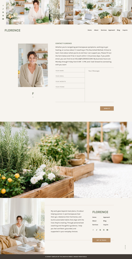
The simplest page on your site, and the one most likely to be quietly broken.
An email address in the footer is not a contact page. People have the attention span of a goldfish on a website, and if reaching you takes any hunting at all, they move on to the next person in the tab beside yours. The page they land on after they hit send matters just as much. Here is what to put on a thank you page.
Give them a short form with four or five fields, and write your email address out underneath it. Some people will not fill out a form, some people do not want to leave your site to open their inbox. Cover both.
Ask only what you need to reply. Name, email, what they are looking for, and a timeline. Every extra field costs you inquiries.
Add whatever else applies to you. Your service area or address with a map if you work locally, your hours, your social links, a phone number if you actually answer it.
Then tell them what happens next, right above or below the form. Something like “I read every inquiry myself, so give me two business days and you will hear back.” That one sentence removes the silence that makes people fill out three other forms while they wait.
Test your own contact form today, from your phone, and see if the message actually arrives.
Two other small things that matter here. Add a thank you page so people know their message went through instead of staring at a blank screen. And put your contact link in the footer of every page, because most people will not go looking for this page at all.
The Pages You Can Skip For Now
Not forever. Just not yet. Get the five core pages working first, then decide what pages you need on your website beyond them.
- A blog, until you can commit to posting consistently. An abandoned blog with two posts from last year hurts more than no blog.
- An FAQ page. Put your questions above the contact form instead, so people read the answer before they email you asking it. When the list gets long enough to need its own page, you will know.
- A resources or freebies page, until you have more than one freebie.
- A shop, until you have a product.
- A press page, unless you have actual press.
Every page you add is a page you have to keep true.
Build five pages well. Add the sixth when a real client question makes you wish you had it.
Common Questions
How many pages should a small business website have?
Five is the sweet spot for most service businesses. Home, services, about, proof, and contact will handle almost every visitor. Add pages only when a specific offer or a repeated client question earns one.
Can I get away with a one page website?
Yes, especially when you are starting out or have one clear offer. A one page site puts the whole path on a single scroll, which is often easier for a beginner to finish and launch than five separate pages. You can always expand it later.
What page should I build first?
Your services page. It is the page that has to sell, and building it first forces you to get clear on your offers, which then makes every other page easier to write.
The Bottom Line
You came here asking what pages do I need on my website, half expecting a list that would take three months to build. Here is your list, and it is five.
Home to point the way. Services to sell. About to build trust. Proof to prove it. Contact to make it easy. That is a complete, working, client booking website, and you could sketch all five out this week.
The site that gets you clients is the one that exists. Not the perfect one still sitting in your head. Build the five, publish it, and improve it once real people start moving through it.
Progress over perfection, every single time.
If you want to build it yourself, shop my Showit templates. Every one of them comes with these five pages already designed and laid out, so you are filling in your words instead of figuring out structure from scratch.
And if you would rather hand it over, Website in a Week is exactly this. Five pages, custom designed for your business, live in seven days. You show up with your content, I build the whole thing.
SHARE THIS POst
Leave a Reply
The beginner's checklist for building a list from zero.
no 02. | DOWNLOAD
Your Starter Guide To Building An Email List.
Download now
An interactive roadmap for showing up when people ask AI for a recommendation.
no 03. | Interactive roadmap
Get AI to Recommend Your Business
let's get started
Exactly what to ask clients so you get testimonials worth putting on your website.
no 01. | download
The Testimonial Blueprint
Download Now